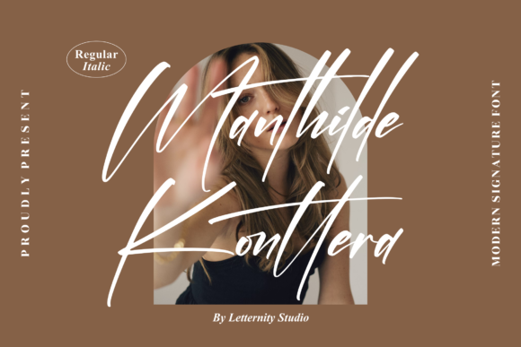
Boldafy: A Refined Script Font for Digital Branding
It started with a client call—a boutique coaching website redesign where every detail needed to feel intentional, warm, and quietly confident. The existing hero section used a generic script font that looked charming at first glance but fell apart on mobile: letters bled into each other, swashes clipped awkwardly, and the headline lost its rhythm below 480px. That’s when I reached for Boldafy.
Boldafy is a well-adjusted script font—not too flamboyant, not too restrained. It walks that fine line between elegance and approachability. Its letterforms have subtle contrast, gentle curves, and just enough personality to feel human without sacrificing clarity. As a Script Amp typeface, it’s designed to amplify voice—not overwhelm it. And because it’s PUA encoded, accessing alternate glyphs, ligatures, and swashes isn’t buried in obscure keyboard shortcuts or font managers. In Figma or Webflow, they appear cleanly in the glyph panel. No guesswork. Just intention.
I dropped Boldafy into the hero headline first: “Clarity Starts Here.” At desktop size, the lowercase ‘c’ and ‘h’ connected with graceful, unobtrusive entry/exit strokes—no visual noise, no forced drama. On mobile? I adjusted tracking slightly (+20) and increased line height by 1.3. The result held up beautifully—even at 28px on iOS Safari. No clipping. No fuzzy rendering. Just clean, legible emphasis.
Where Boldafy shines most is in moments of deliberate focus: hero titles, section headers, CTA buttons with short action phrases (“Begin Your Journey”, “Explore the Collection”), and branded quote cards on blog layouts. It’s not built for long paragraphs—that’s where pairing matters. I paired it with Inter (a highly readable, open-source sans serif) for body copy and navigation. The contrast worked instantly: Boldafy brought warmth and identity; Inter delivered neutrality and speed. No competing personalities. Just hierarchy with purpose.
For a recent product landing page—this time for a small-batch ceramic studio—I used Boldafy in three distinct ways: as the main logo lockup (rendered as SVG text for crisp scaling), as the headline above an image banner (with subtle white drop shadow for readability on textured backgrounds), and as decorative accents in the footer (“Handmade • Thoughtful • Timeless”). Each use reinforced brand tone without redundancy. Because Boldafy includes multiple stylistic alternates, I swapped in a tighter ‘a’ and more upright ‘t’ for the logo version—subtle, but enough to make it feel custom.
Readability wasn’t automatic—it required testing. On dark mode interfaces, I added a soft 1px white stroke (via CSS text-stroke) to maintain contrast without losing fluidity. Over full-bleed photography, I kept background overlays at 65% opacity and limited Boldafy to headlines only—never body text or captions. And crucially: I avoided using it in buttons smaller than 44px tall. Swashes need breathing room. Mobile thumbs need tap targets. Good typography respects both.
What makes Boldafy especially practical for digital creators is its thoughtful construction. It’s not a “hand-drawn” script trying too hard to mimic ink—it’s digitally native. Letters align cleanly on the baseline, spacing feels consistent across weights (though Boldafy currently ships in one refined weight), and punctuation marks sit comfortably beside letters instead of floating awkwardly. That consistency pays off in responsive layouts, email headers, and social media banners alike.
I also checked licensing before embedding it on the live site. Boldafy is a commercial font, so I confirmed the license covered web use, client projects, and e-commerce platforms—no surprises later. It’s available in WOFF2 format (ideal for fast loading), and the package includes OTF and TTF files for design tools and print-ready assets like digital brand kits or packaging mockups. No missing diacritics or broken multilingual support—essential if your audience spans English, Spanish, or French-speaking regions.
One unexpected win? Using Boldafy in animated micro-interactions. On hover, I applied a gentle 0.3s ease-in-out transform to lift the headline 2px—just enough to suggest responsiveness without gimmickry. Because the font’s proportions are balanced, the movement felt organic, not wobbly. Try that with a less-refined script font, and you’ll get jitter.
That said, Boldafy isn’t for every headline. I wouldn’t use it for data dashboards, SaaS feature lists, or legal disclaimers. It’s not a workhorse—it’s a spotlight. Use it where you want attention, warmth, and a quiet sense of care. Think: course sales pages highlighting transformation (“From Stuck to Steady”), portfolio sites introducing creative work (“Design with Depth”), or campaign landing pages building emotional resonance (“This Season, Slow Down”).
Pairing advice that stuck with me: avoid other decorative fonts nearby. If Boldafy leads, let the supporting type do the heavy lifting—clean sans serifs for interface labels, neutral serifs like Charter for editorial blog posts, or even system fonts for ultra-fast-loading contexts. Consistency isn’t about repetition—it’s about respectful contrast.
In the end, what made Boldafy land wasn’t just how it looked—but how it behaved. It loaded quickly. It scaled cleanly. It communicated tone without explanation. And when the client saw the final hero section—on their own phone, mid-call—they paused and said, “That feels like *us*.” That’s the quiet power of good typography: not decoration, but distillation.
If you’re choosing a script font for your next digital project—whether it’s a coaching site, online shop banner, course launch page, or brand kit—you’re not just picking letters. You’re choosing how people feel before they read a word. Boldafy doesn’t shout. It leans in. And in today’s crowded digital space, that kind of quiet confidence is rare—and valuable.